BETTER BREADS
THE SUPER VEGAN BAKERY
Better Breads is a small vegan bakery based in Singapore with a great ambition: feed the body and soul of their customers through bread. To achieve this goal they prepare daily different bread varieties— which stand out for being really vegan, nutritious, organic and freshly baked.
The analysis revealed that Better breads had an excellent product but a big problem, the brand didn't communicate correctly the differential value of the product, causing confusion in the public when it comes to appreciating the great benefits of its breads.
The challenge for Diferente was to create a totally new image. Where the symbol — built from the letter B— wants to visualize something unique on its breads: always a piece of the main ingredient it's visible above each piece, identifying the type of bread.
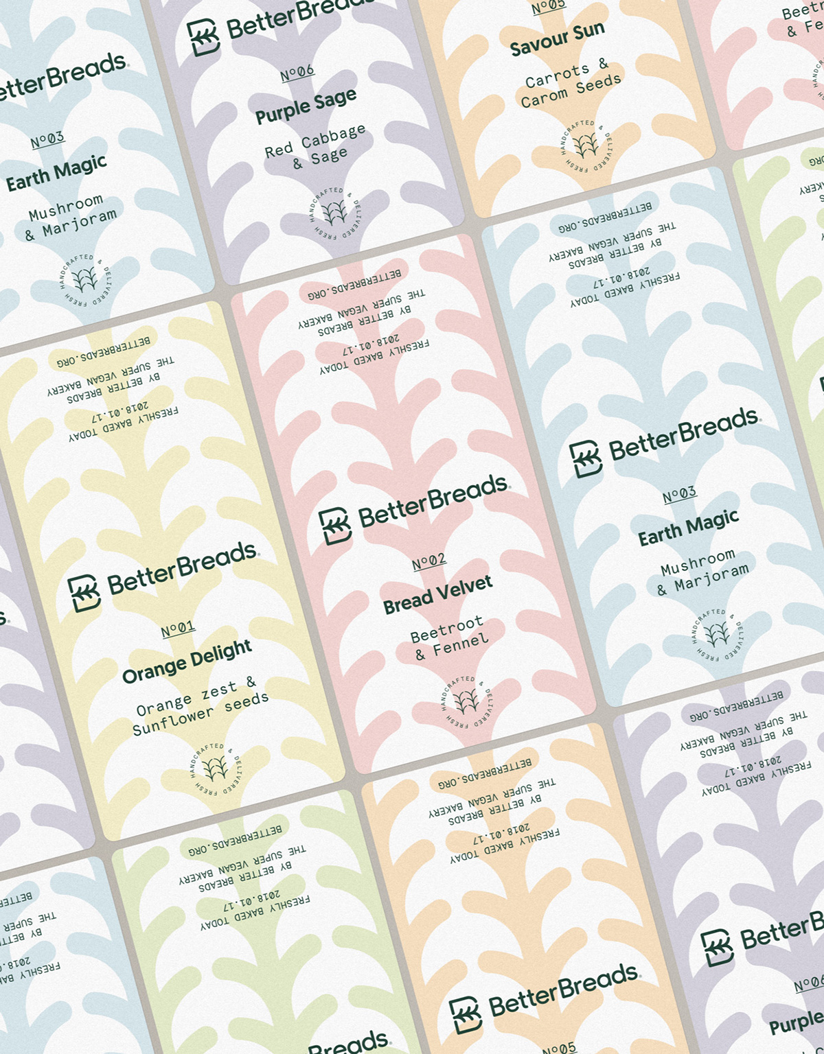
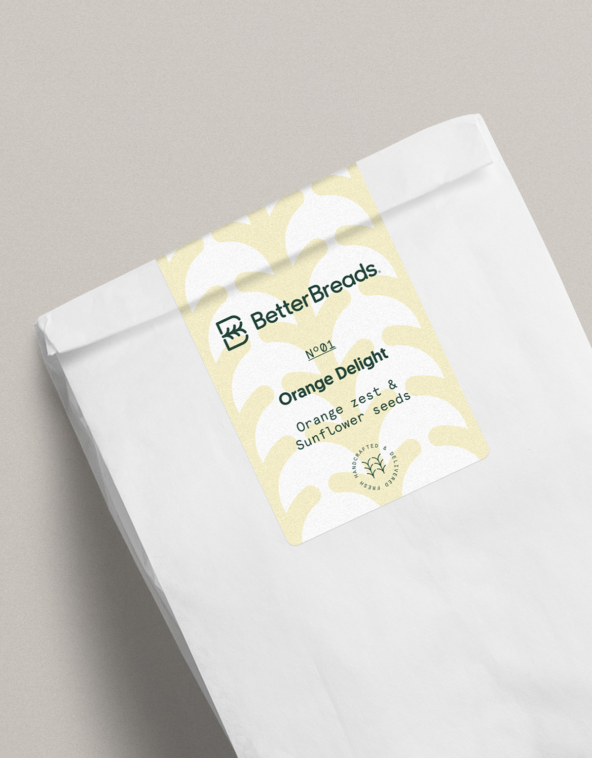
Key elements of the symbol are taken as a reference to develop the entire identity system of the brand. Creating a proper language for the bakery that is implemented both in its communication and in the breads packaging system. Where an editable sticker — printed locally at the bakery— can be modified to change the color, name, date and ingredients in order to label easily the different types of bread made for each day.


YEAR & LOCATION
2018, Singapore.
ASSIGNMENT
Symbol, Wordmark, Identity System, Stationary, Communication System, Tone of Voice, Signage, Packaging.
PRODUCT PHOTOGRAPHY
Lynn Chen
↓
↓
More at diferente.info

